Overview
The issue is that certain dog food companies provide unhealthy products for dogs and may mislead customers, who may only become aware of this after their dogs experience negative health effects or after hearing about it in the news.
Solution
The solution is a mobile marketplace for dog food that simplifies the search process by featuring reputable brands such as Farmers Dog and Only Open Farms. This ensures that users can easily find the best quality food for their dogs
Problem Statement
This dog service app will help dog owners find the food and treats that dogs love.
The Goal
I want to identify the frustrations pet parents experience during the process of choosing and buying dog food.
Research
Conducted a survey questionnaire by placing the questionnaires around my hometown and walking around a dog park asking different people to fill out the survey. I also posted the survey on social media. I received a total of 17 survey answers. The survey consisted of three questions, and I had to reduce the 16 participants to only two personas.
Three Takeaways
Personas
Affinity Map
I analyzed the findings and created Affinity maps, which helped me identify the positive and negative points of the current app, as well as opportunities for improvement.
Journey Map
Combined User Problem Statement
Our customers desire a dog food service that offers economically priced treats and healthy dog food.
Competitive audit
Competitive audit summary
The competitive audit analyzed key competitors in the dog food market, both inside and outside the organization. Outside competitors included PetSmart, Amazon, and Chewy, while inside competitors were Farmer's Dog, The OpenFarm, and Ollie. The audit revealed the strengths and weaknesses of each competitor:
Chewy: Positioned itself as a user-friendly one-stop shop with convenient services like auto-ship and prescription drugs.
Farmer's Dog: Focused on providing clean and high-quality dog food, showcasing testimonials through videos.
Amazon: Emphasized its one-day shipping policy and extensive marketplace.
The audit also identified gaps and opportunities for improvement:
Gaps: The Farmer's Dog and The OpenFarm lack an app, PetSmart needs a better interface, and Amazon has overwhelming infinite scrolling.
Opportunities for Improvement: Offering different languages, creating a cleaner registration system, removing the affinity scroll, displaying Apple Pay after registration, and prioritizing registration for a better user experience.
This valuable information will guide the development and improvement of the mobile marketplace for dog food, ensuring it stands out in terms of accessibility, quality, and user experience.
Original
The competitive audit analyzed the key competitors in the dog food market, both inside and outside of the organization. The outside competitors included PetSmart, Amazon, and Chewy, while the inside competitors were Farmer's Dog, The OpenFarm, and Ollie.
Chewy, an online pet food and accessory corporation, positioned itself as a one-stop shop with a user-friendly app and convenient services like auto-ship and prescription drugs. The Farmer's Dog focused on providing clean and high-quality dog food, showcasing testimonials through videos to highlight product quality and customer satisfaction. Amazon emphasized its one-day shipping policy and extensive marketplace.
The strengths of Chewy included its visual design, branding through video testimonials, minimalist look, color branding, and prominent discounts. OpenFarm lacked distinctiveness in its logo and could improve by prioritizing the display of cat and dog food. Amazon had weaknesses such as overwhelming infinite scrolling, a busy homepage, and a lack of pre-recorded features to assist customers. Ollie had a weakness in providing limited information until customers created an account.
Gaps in the market were identified, such as the absence of an app for The Farmer's Dog and The OpenFarm, the need for a better interface for PetSmart, and the overwhelming affinity scroll on Amazon. Opportunities for improvement included offering different languages, creating a cleaner registration system, removing the affinity scroll, displaying Apple Pay after registration, prioritizing registration, and ensuring a clean and precise user experience.
Overall, the competitive audit provided insights into the positioning, strengths, weaknesses, gaps, and opportunities of key competitors in the dog food market. This information will inform the development and improvement of the mobile marketplace for dog food, ensuring that it stands out in terms of accessibility, quality, and user experience.
Business Value Proposition
User Problem Statement
Our customers desire a dog food service that offers economically priced treats and healthy dog food. They are looking for a convenient and affordable way to buy dog food and treats. They want to provide their dogs with the best quality food and treats but are struggling financially.
Hypothesis Statement
For our customers, we will offer reasonably priced, nutritional human-grade dog food. We will contract with reputable human-grade dog food brands to ensure the highest quality products.
Value Proposition
What do we offer? We provide a convenient and affordable way to buy dog food and treats. We offer a wide selection of human-grade dog food brands.
Who is the target audience? Our target audience is owners of dogs who are concerned about providing their dogs with the best quality food and treats but have financial constraints.
What is our value? We offer human-grade dog food that is both affordable and nutritious. We also provide a rewards system using an algorithmic method to enhance the affordability of our products.
User Flow Diagram
During the design process, I proceeded to create a user flow diagram, which helped visualize the steps and interactions within the app. This diagram provided a clear understanding of the user journey and informed the structure of the app.
To gain a comprehensive understanding of the app's potential structure, I initially developed a user-step diagram. This diagram provided a visual representation of the steps and interactions within the app, allowing for a clear understanding of the user journey and informing the overall structure of the app.
Throughout the design process, I continued to refine and iterate on the app's structure, ultimately creating a user flow diagram. This diagram served as a valuable tool to visualize the user's path through the app and ensure a seamless and intuitive user experience.
By utilizing these design techniques and tools, I created a well-structured and user-friendly mobile app that effectively addresses the needs of the target audience.
During the design process, I finalized the potential structure of the app and proceeded to create wireframes. I carefully selected and evaluated likely design elements to be used in the mock-up.
Wireframes
The in-depth research into human-grade dog food brands that aligns with my business guidelines. This involved carefully selecting and examining each brand. These are the brands that I chose.
Login:
This is the login and registration page for the app. The only clickable button on this page is the Login and Registration button. When the site goes live, the email and password input fields will be active when launched.
The Registration:
During the registration process, users are prompted to provide detailed information about their dogs. This allows us to gain a deeper understanding of their dogs' needs and provide them with an optimal level of service. Additionally, users are presented with additional questions about their dogs to further enhance our understanding. This comprehensive registration process ensures that we are able to deliver a personalized and tailored experience to each user and their furry companions.
Home:
Creating a brand homepage makes it easier for customers to find the brands they’re looking for and compare brands. This was implemented based on research findings that showed difficulty in finding and comparing healthy brands. The ads on the top of the page are intended to notify users of different deals and promotions within the app.
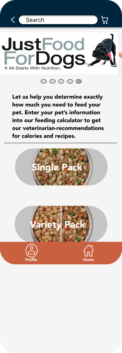
Every brand has a different style of interface.
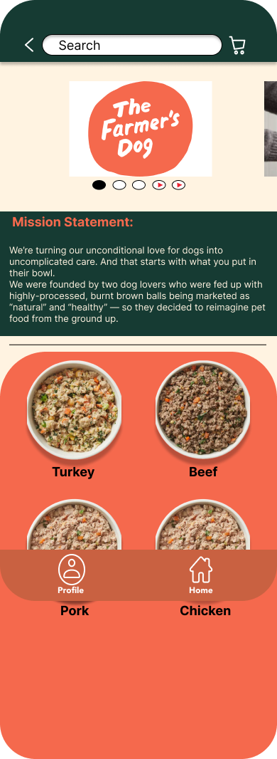
The Farm Dog (Home):
Creating a brand homepage makes it easier for customers to find the brands they’re looking for and compare brands. This was implemented based on research findings that showed difficulty in finding and comparing healthy brands. The ads on the top of the page are intended to notify users of different deals and promotions within the app.
The Farmers Dog(Product):
This product page contains images, a video, and detailed product information to help you make an informed decision. The product is prominently showcased on the page with a carousel of four images and a video. Swipe indicators below the carousel reveal what is featured above. The five-star rating system is a standard for online stores. There are four delicious flavors to choose from! The carousel below offers different sizes of food to choose from. To add an item to your cart, click the “add to cart” button on the left. When you’re ready to checkout, click the “checkout” button on the right. This is the standard convention for online shopping sites.
(Revise):
During the design process, I consolidated the four circular elements into a single element since video descriptions were not available for the product. Additionally, I eliminated three out of the four redundant flavors on the brand page. Furthermore, this particular brand only offers one fixed-weight option. To provide clarity, I included a square box indicating the available quantity for purchase.
Receipts
I created a clean and precise receipt that includes the chosen item, its name, rewards, total, and a disclaimer stating that this is a third-party app. Payment options such as Visa, MasterCard, and PayPal, as well as the home address, are also displayed.
Prototype:
I created digital wireframes and prototypes in Figma based on the wireframes mentioned above. Four images that are shown below are part of the prototype.


In the dog food app, I designed unique interfaces for each brand, carefully considering their individual identities and target audience. By creating distinct visual experiences, I aimed to evoke a specific brand personality and establish a strong connection with users. These interface designs effectively reflect the essence of each brand and contribute to a cohesive user experience within the app.
I took into account the unique characteristics and values of each brand when designing their interfaces. For example, the interface for The Farm's Dog exudes a natural and wholesome feel, emphasizing the use of fresh ingredients and promoting a healthy lifestyle for dogs. On the other hand, Ollie's interface showcases modern and sleek design elements, reflecting their commitment to providing high-quality and personalized dog food options. Just Food for Dogs' interface strikes a balance between simplicity and vibrancy, conveying their dedication to creating nutritious and delicious meals for dogs.
By humanizing the design of these interfaces, I aimed to create an emotional connection between users and the brands. The visuals, color schemes, and overall aesthetics were carefully chosen to resonate with pet owners and convey trust, reliability, and care. This approach enhances the overall user experience and reinforces the brand identities, making the app more engaging and appealing to dog owners seeking the best food options for their beloved pets.
User testing
I conducted a usability test with five participants and gathered valuable insights. Here are the three key takeaways from our findings:
Cluster:
In the dog food app, I dedicated my attention to developing a robust brand comparison feature. This feature empowers users to make informed decisions by allowing them to compare various dog food brands side by side. By presenting key information and details in a clear and concise manner, users can easily evaluate the different options and choose the brand that best suits their preferences and requirements. This brand comparison feature enhances the user experience by providing a comprehensive overview of the available choices, ultimately helping users find the perfect dog food for their furry companions.
Solution
In the dog food app, I dedicated my attention to developing a robust brand comparison feature. This feature empowers users to make informed decisions by allowing them to compare various dog food brands side by side. By presenting key information and details in a clear and concise manner, users can easily evaluate the different options and choose the brand that best suits their preferences and requirements. This brand comparison feature enhances the user experience by providing a comprehensive overview of the available choices, ultimately helping users find the perfect dog food for their furry companions.
Results
Based on the survey results, it is evident that the majority of participants had a positive perception of the product and appreciated its usefulness. The feedback consistently highlighted the satisfaction of users with the app, with a high percentage expressing their enjoyment of the overall user experience. This positive reception signifies the app's effectiveness in meeting the needs and expectations of its users. It demonstrates that the product and its accompanying fonts have successfully contributed to a positive user experience, making it a valuable and well-received tool. The feedback from the survey further emphasizes the app's ability to engage users and provide them with a satisfying and enjoyable mall experience. Overall, these findings validate the effectiveness and appeal of the app, indicating its potential for widespread adoption and success.
As a designer, I have learned several valuable lessons throughout this project:
1. I discovered the significance of developing a design library. By creating a library of reusable components, I was able to save time and effort when designing new screens and features.
2. I found that conducting thorough research and asking better questions is crucial for gaining insights and understanding user needs. This helped me design solutions that truly address the frustrations and challenges experienced by pet parents.
3. By incorporating these lessons into my design approach, I was able to create a user-friendly and effective mobile marketplace for dog food, providing a seamless experience for users to find high-quality food for their beloved pets.
Tools Used
Figma,
Fig-Jam
Jam-bored
Brand websites: Ollie, The Farmers Dog, Just Food of dogs, Open Farm


